This section we’ll learn how to design Page Models.
We highly recommand starting by reading the layout document first to understand the concepts behind page design.
Access
You can access Page models view from the home page :
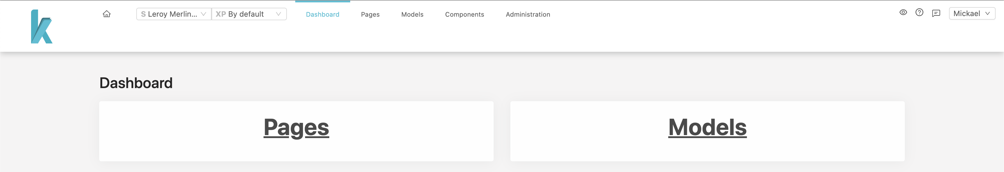
Or from the header :

List
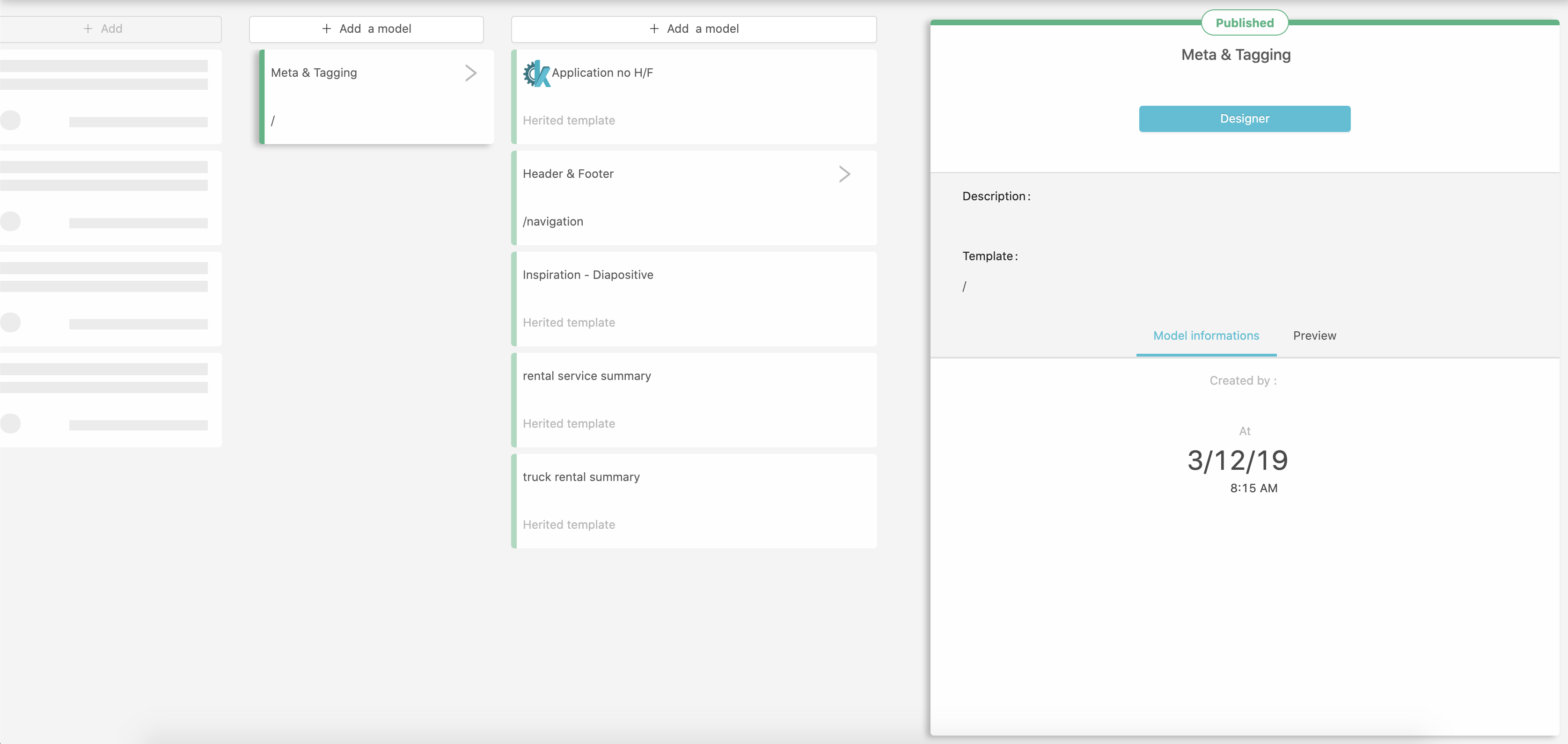
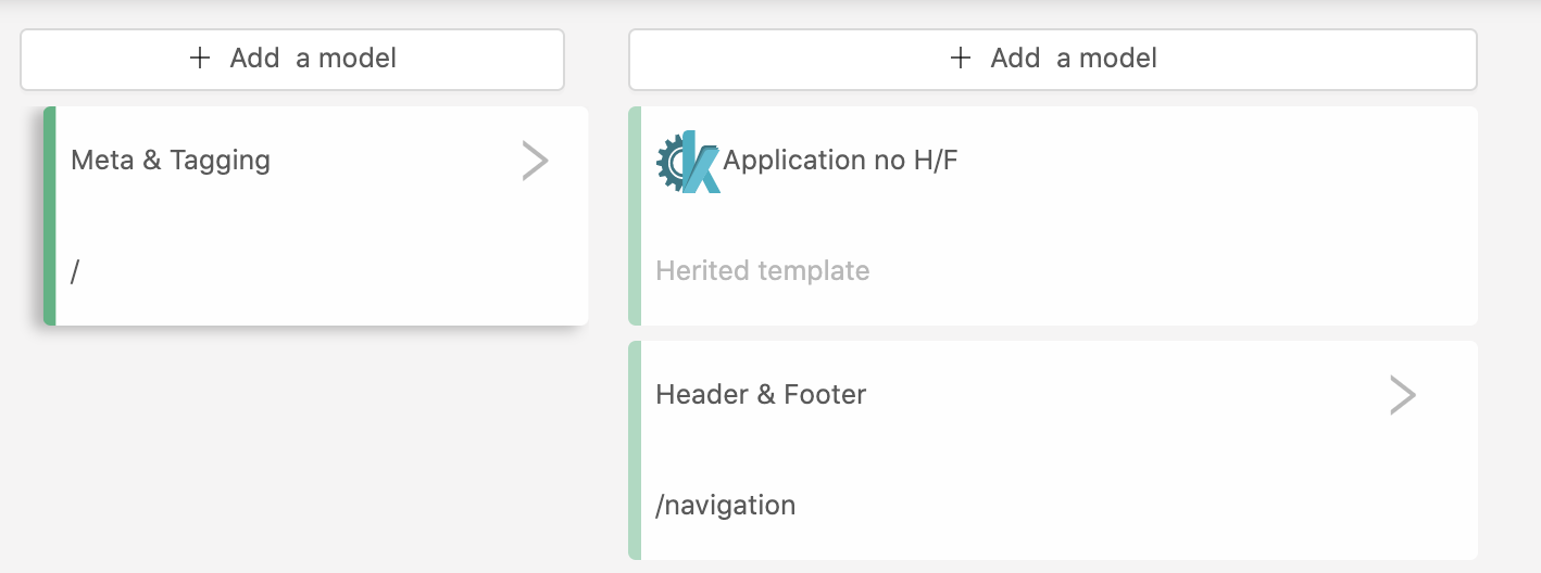
From this view you can see all created page models, which are organized like a tree. This is because each model will inherit it’s parents elements.
On the right side of the screen, a card display informations about the currently selected model. You can access the design view from there by clicking the Designer button or by double clicking the model’s name in the tree.
Creating a model
You can access the model’s creation form by clicking the + Add a model in the top of the tree at any level. This will open the creation form card.
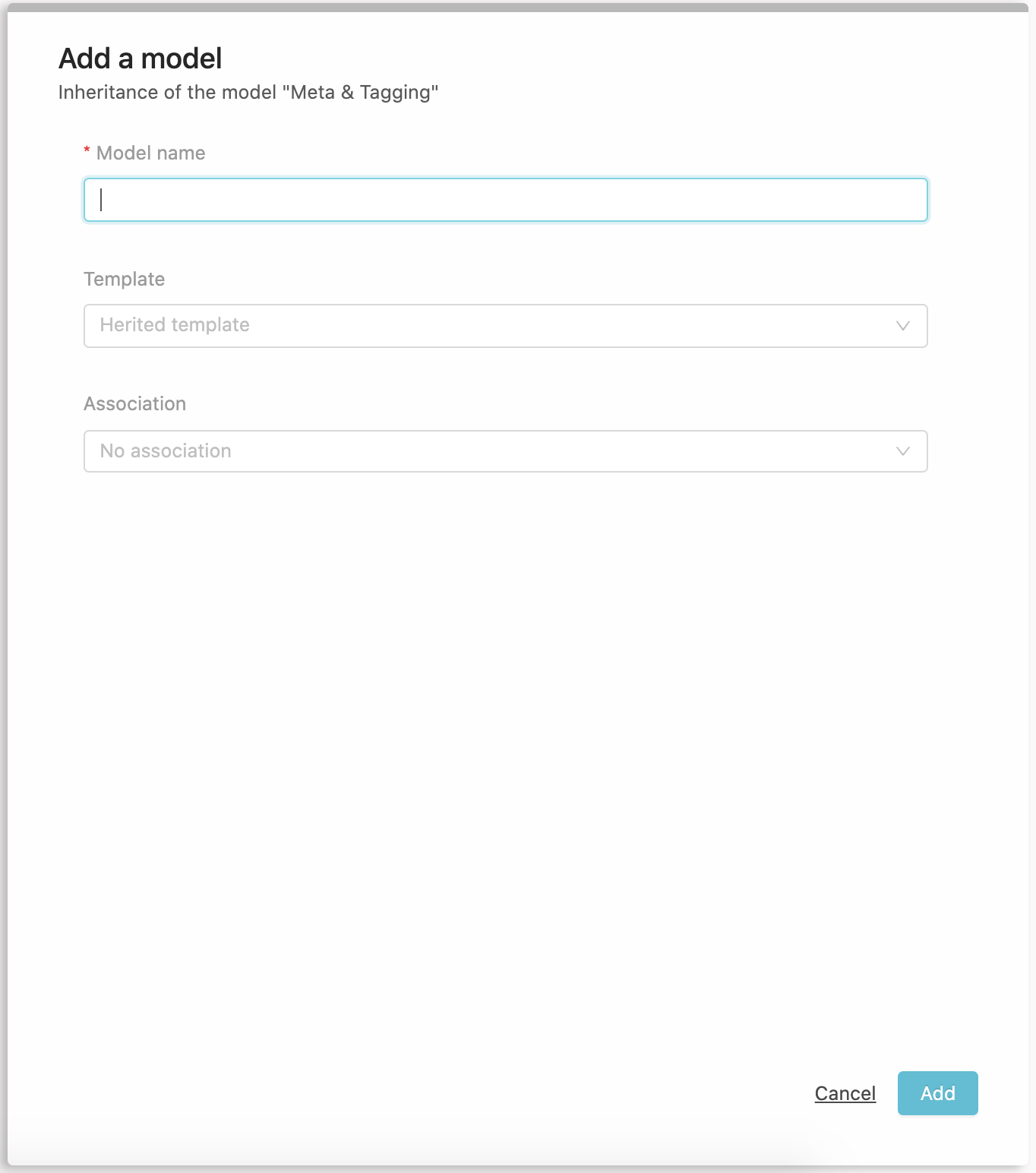
Inheritance of the "model XXX"
You are asked for :
- A model name that will be displayed in the tree
- A template, you should see the list of available templates retrieved from your Site application
- An optional association to a Resource type or to an error page status.
When setting a resource type, the model will be used as the base template for each resource IDs of this type (dynamic page). This is usefull for resources like products, for which you don’t want to create hundred or thousand pages by hand. One Model to rule them all !
Click Add to complete the model’s creation. The model will appear on the tree, you can now Design it.
You can see the publication status on top of the information card as well.
Design
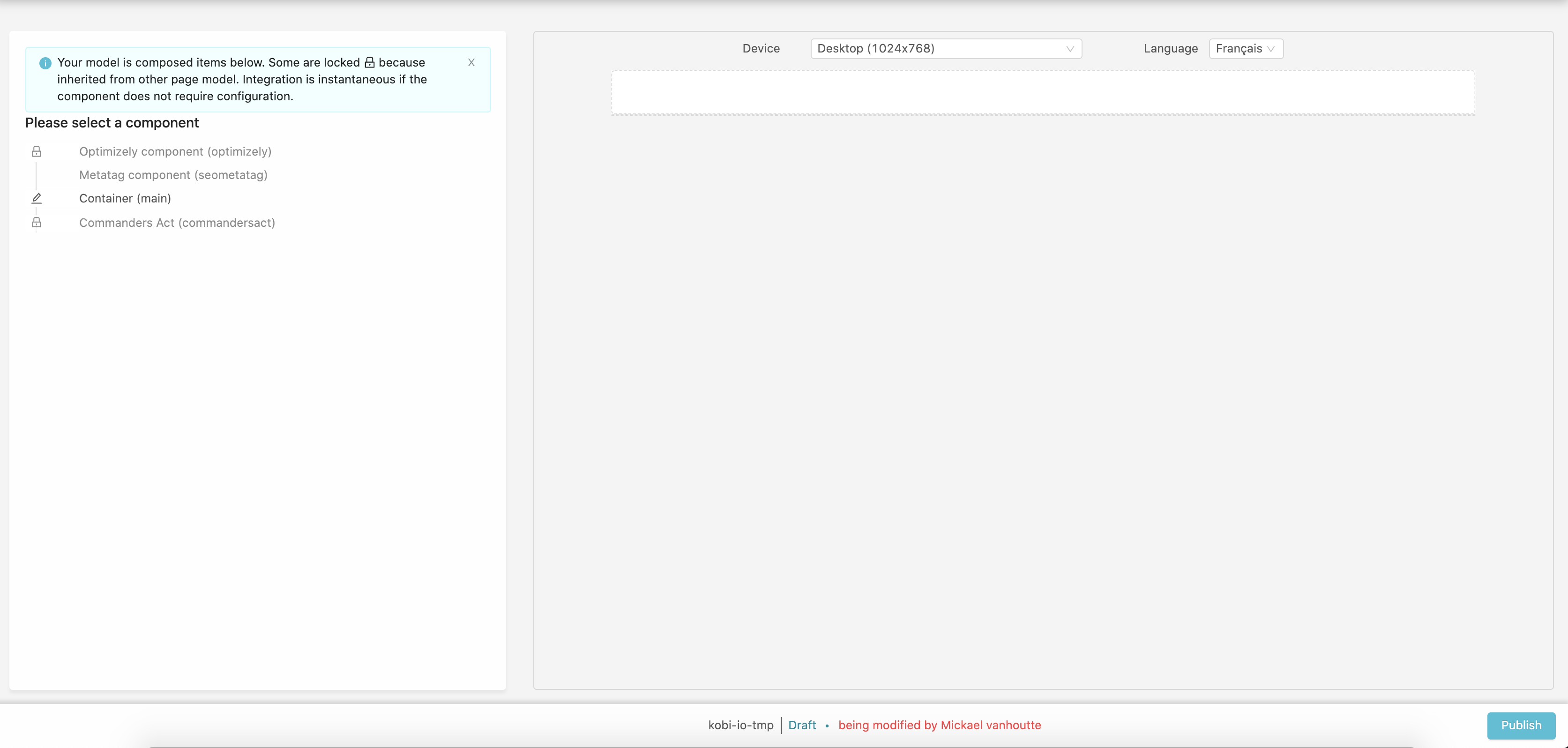
On the left side you will see the list of already added components, they may come from the site’s template itself or from model’s inheritance, hence aren’t editable.
In our example we already have 4 components :
- Optimizely
- Metatag
- A Container
- Commander’s Act
When clicking one of them, a tooltip display where the component is configured (which parent model) and propose a link to this model.
Aside from the container, all these components are invisible (fragments with visible=false), so the right side of the page is empty.
On the top of the right side you can select different devices or languages (if multiple locales have been defined in your site configuration).
Core components
KOBI features 2 core components that you can add in your page.
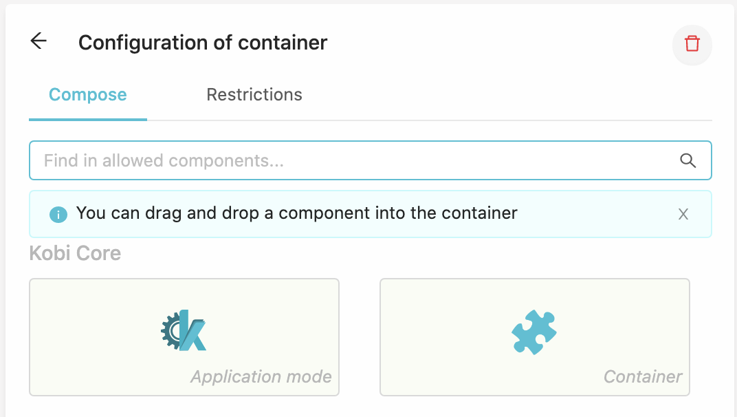
Containers
A container is an area where you can add other components.
Click on a container to start adding components :
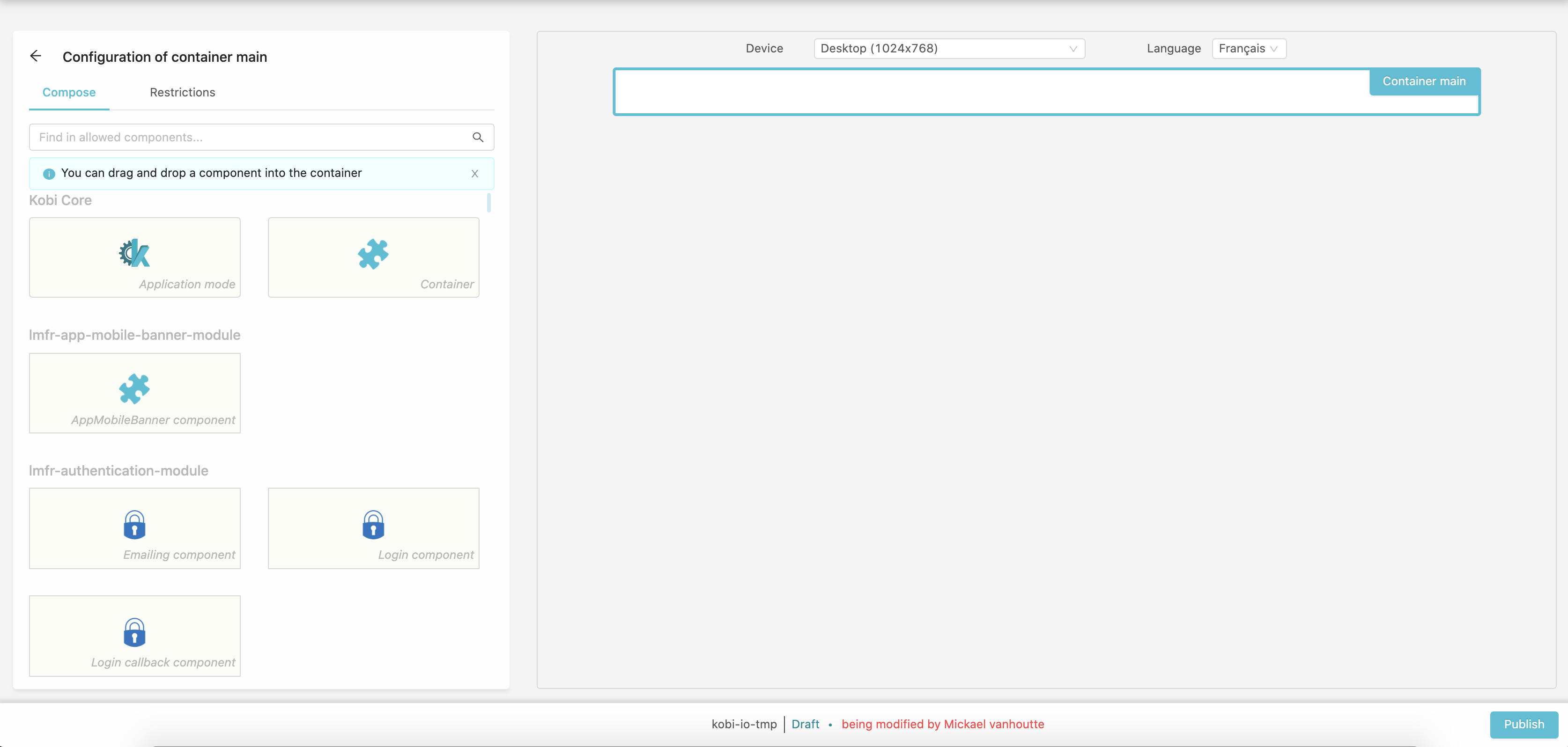
The left pane changed to display a list of available components in your Site. You can use the input to search through them by name.
You can drag components to the container to add them.
If the added component requires a configuration, a form will be displayed to fill them.
Restrictions
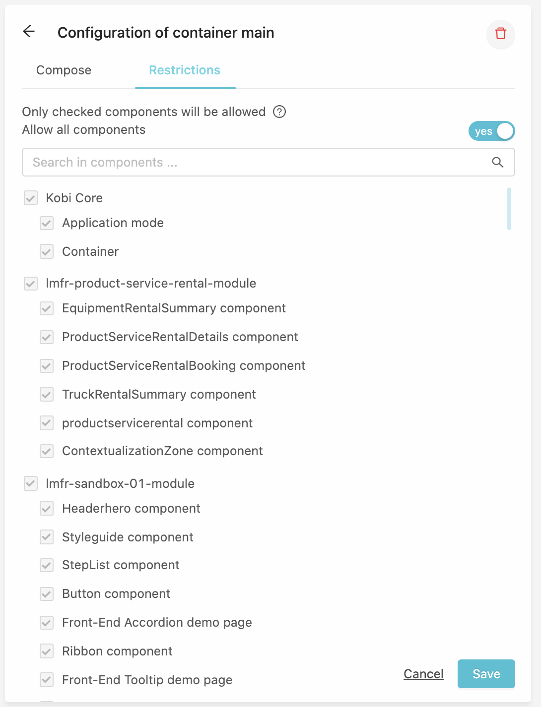
You can apply restrictions for this container to prevent children models or pages to add certain components, this form is pretty straightforward, enable restriction using the toggle and select the components you want to allow in this container. Save the form to apply the restrictions.
Application mode
The application mode components acts like a container but for SPA (Single Page Application).
We will use them for some sections of a site where you need long process forms (account creation, delivery & payment…), or to use already existing autonomous application.
To make that possible your application should declare application-context at registration.
The registered application-contexts will be listed in the Application mode component.
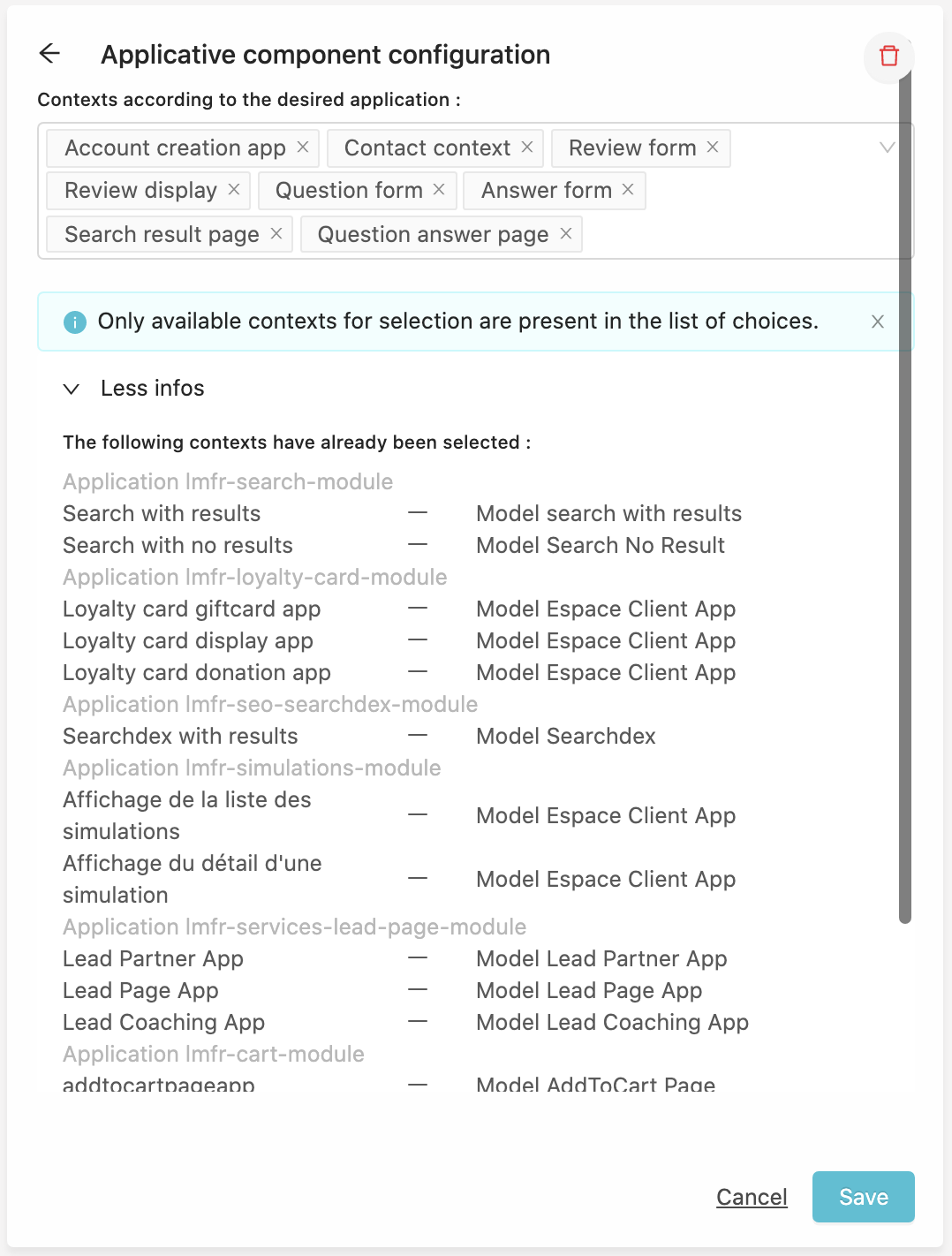
Then, on a request that matches your application (See Application resolution), KOBI will forward the request to your application, and get a context in the response’s headers. We can now find the Model in which this context is set and add the Model’s fragments to render the page.
Publication
When you are done with the design you can publish it in the footer.
Model informations
From the header, select the Model informations tab :
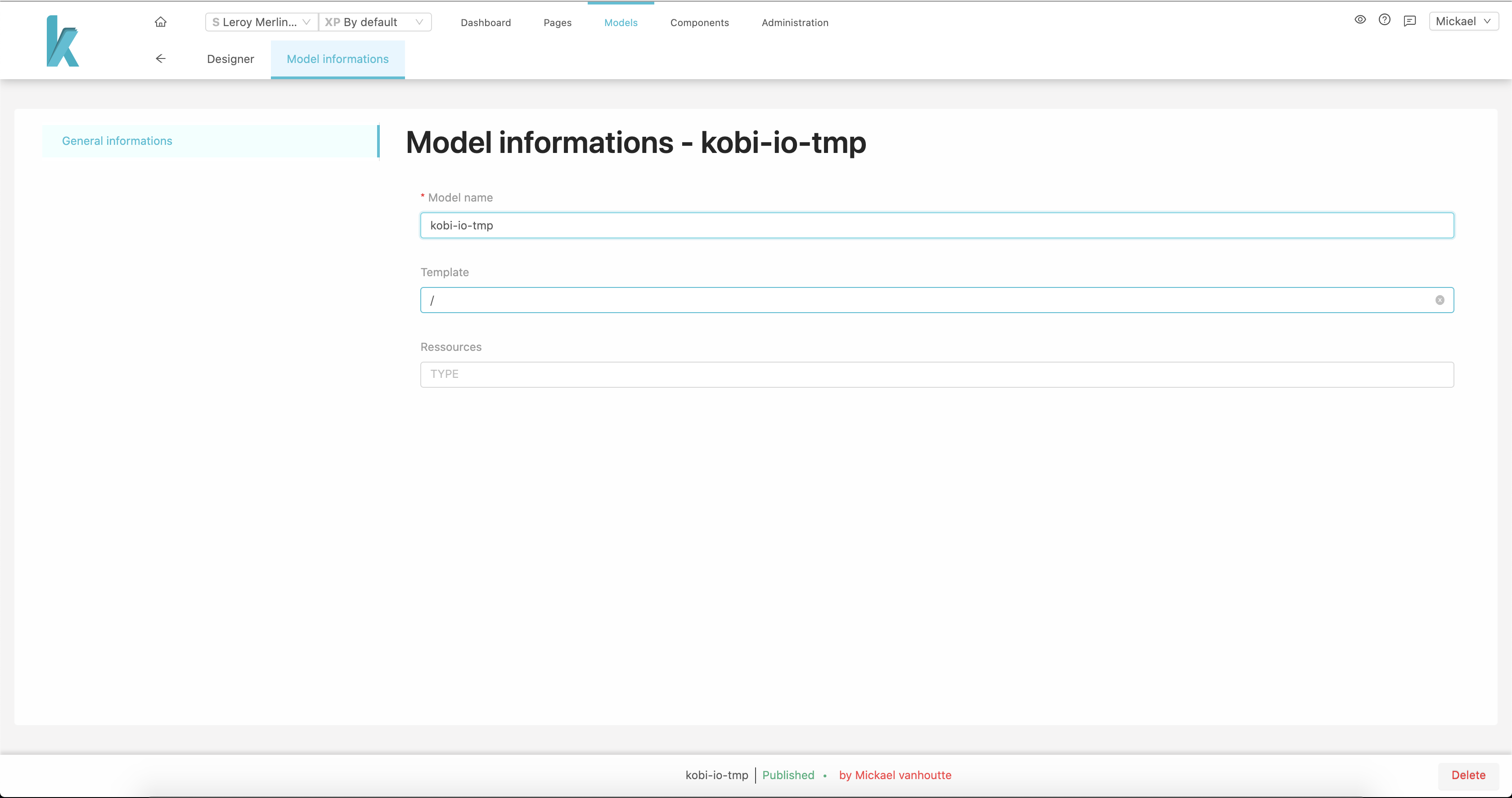
From here you can edit your model’s name, template or associated resource.
In the footer you can delete the model, if no child model exist nor pages use it.